
I’ve not done much on this in the last few months. It’s been a rough year (family in Ukraine, loss of family dog, me being in hospital and then me having covid). Never the less we’ve pulled through all of these challenges and I really wanted to provide some updates to how far I have managed to get. I will hopefully pick this up again in the next month or so.
Firstly what has been achieved? I have managed to target the S&P 500 quite nicely even though it’s in a bear market and turning into a true nightmare (I’m holding on to all my investments and slowly averaging down positions as the bear continues to growl.
The following is the analysis that I’m running at present:
Reference: S&P 500 Company List – This is a list of the companies found in the S&P 500 and updated frequently. It is clickable, where I can see a small chart of progress of the stock and also the daily performance in data for the last ten market days.
Stock Market Pages
Analysis: S&P 500 Daily Risers – This is a list of the S&P 500 which includes only the stocks that have managed to rise in the last market day.
Analysis: S&P 500 Daily Losers – This is a list of the S&P 500 which includes only the stocks that have managed to drop in the last market day.
Analysis: S&P 500 Big Drop Log – This is a log of the S&P 500 which includes only the stocks that have managed to drop more than 7% within a single market day.
Analysis: S&P 500 Big Gain Log – This is a log of the S&P 500 which includes only the stocks that have managed to gain more than 7% within a single market day.
Analysis: S&P 500 Triple Summary – This is a summary of how the S&P 500 stocks have performed over the last three market days (I actually find this very useful).
Analysis: S&P 500 Triple Negatives – This is a list of companies in the S&P 500 that have dropped in value across three consecutive days. (I also find this very insightful)
Analysis: S&P 500 Triple Positives – This is a list of companies in the S&P 500 that have gained in value across three consecutive days. (I also find this very insightful)
Stock Market Charts
Chart: S&P 500 Bear Vs Bull – This is a chart that gets updated daily and shows how many stocks gained in value vs dropped in value. It is a highly interesting graph, especially in a bear market that we’re seeing.
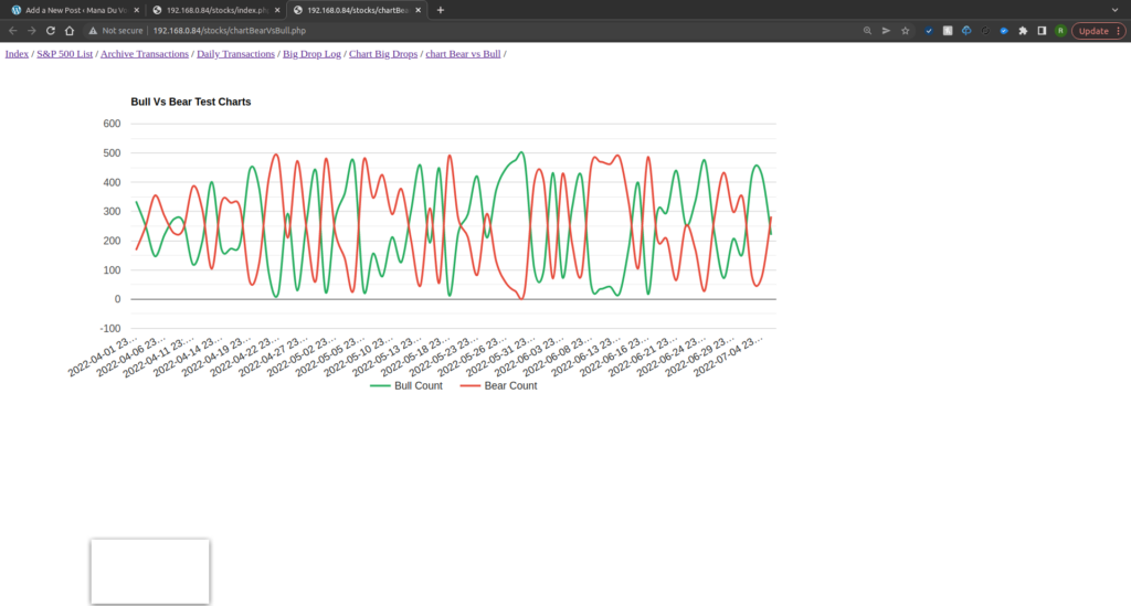
Chart: S&P 500 Big Drops – This is a chart that tracks the number of big drops (more than 7%) in the S&P 500 across time.

Chart: S&P 500 Big Gains – This is a chart that tracks the number of big gains (more than 7%) in the S&P 500 across time.
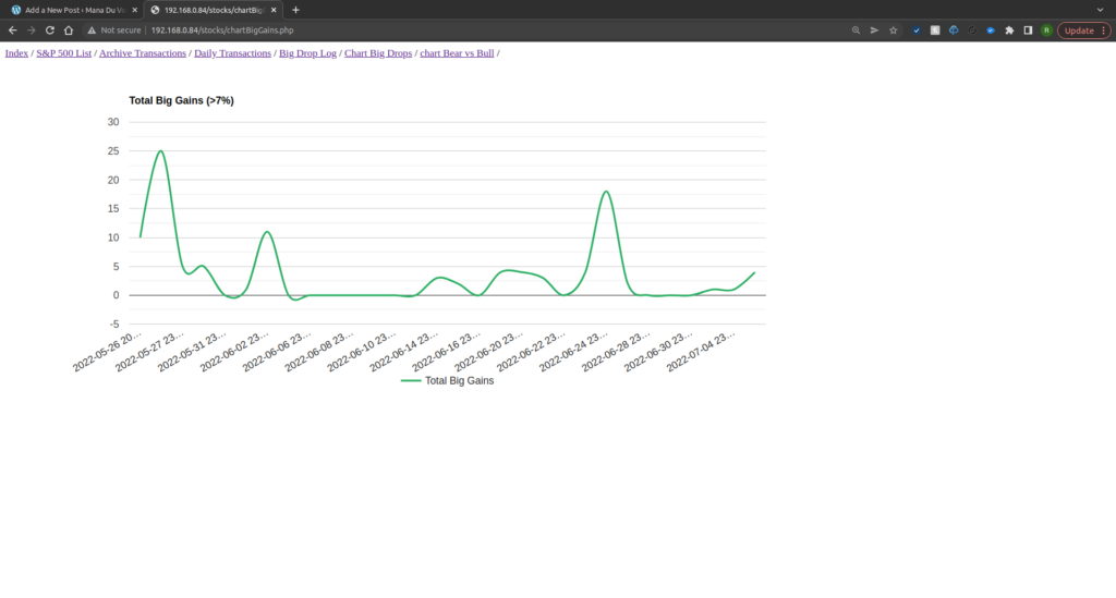
Chart: Triple Positives Vs Negatives – This is a chart that measures the number of stocks that have gained value consecutively across three days vs number of stocks that have lost value consecutively across three days.

All charting I have managed to achieve with google charts technology. It was surprising simple to use and the results I find quite pleasing on the eyes. Please keep in mind that I have not done any design work, that would be for a later stage.
Next steps will likely include starting to explore levels of volatility in the stocks, maybe explore some RSI or maybe the MACD (12/26). One thing I would also like to start doing, is progressing this towards including the FTSE 250 as well. There are a lot of options, maybe even include tracking my own portfolio. Who knows, I’ll see what I fancy as I get to the work that’s needed.
For now though, the pages developed have managed to provide some really insightful views on the S&P 500, which is great.